
Viva Health Website Redesign
Creating one seamless digital experience for multiple audiences for an Alabama-based healthcare and medicare website.
My team worked to complete a digital transformation of Viva Health's website ecosystem, combining a modernized user experience, simplified navigation, and a scalable, component-based design system to better serve members, providers, and prospective customers across Alabama.
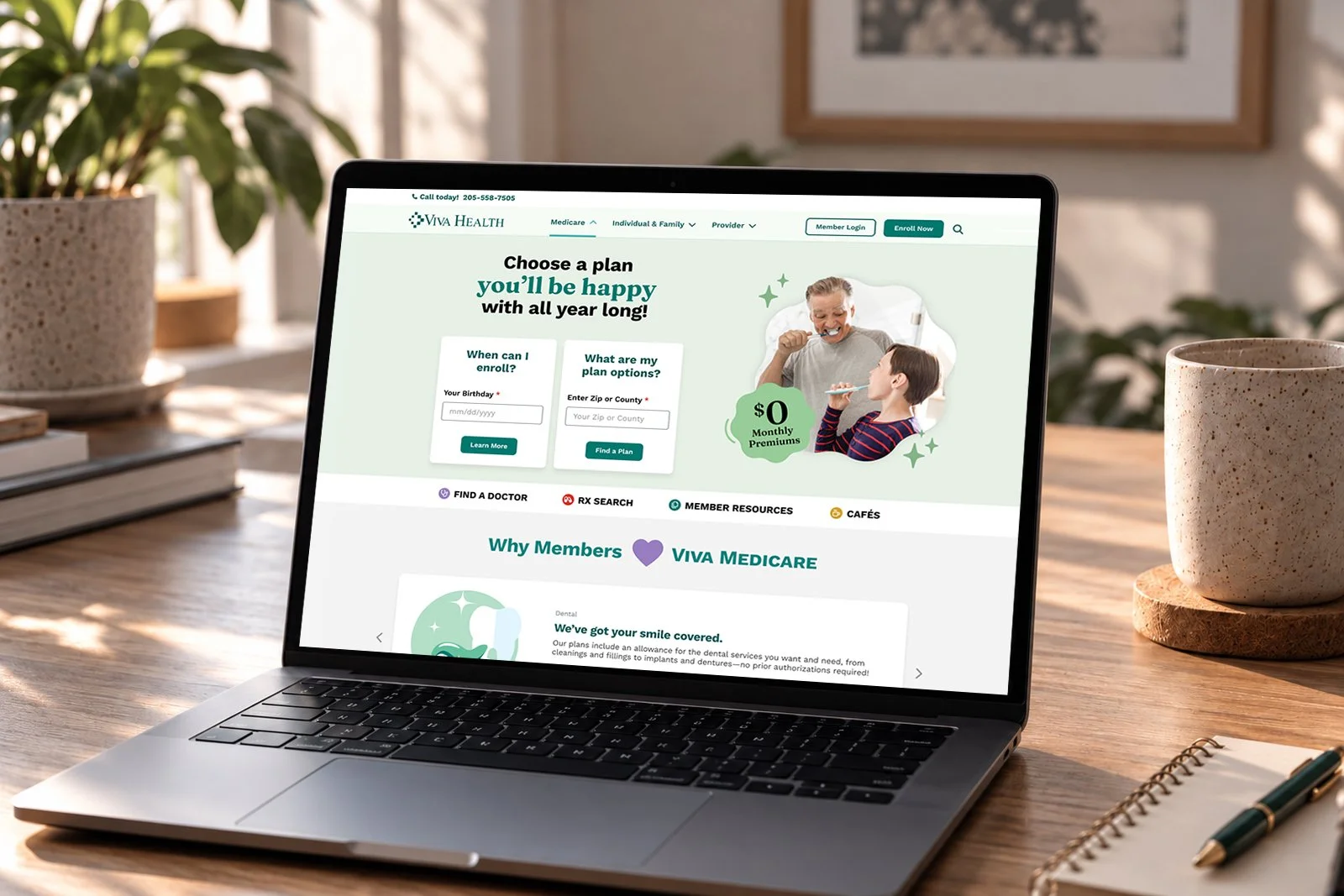
Viva Health serves a diverse audience, from individuals and businesses seeking health insurance to Medicare members and healthcare providers. With each audience bringing different needs and expectations, the challenge was to create a cohesive digital experience that made complex healthcare information easier to find, understand, and navigate.
Working closely with the client and development team, we reimagined the website from the ground up—rethinking its structure, simplifying key user journeys, and establishing a flexible design system that could support the entire Viva Health ecosystem.
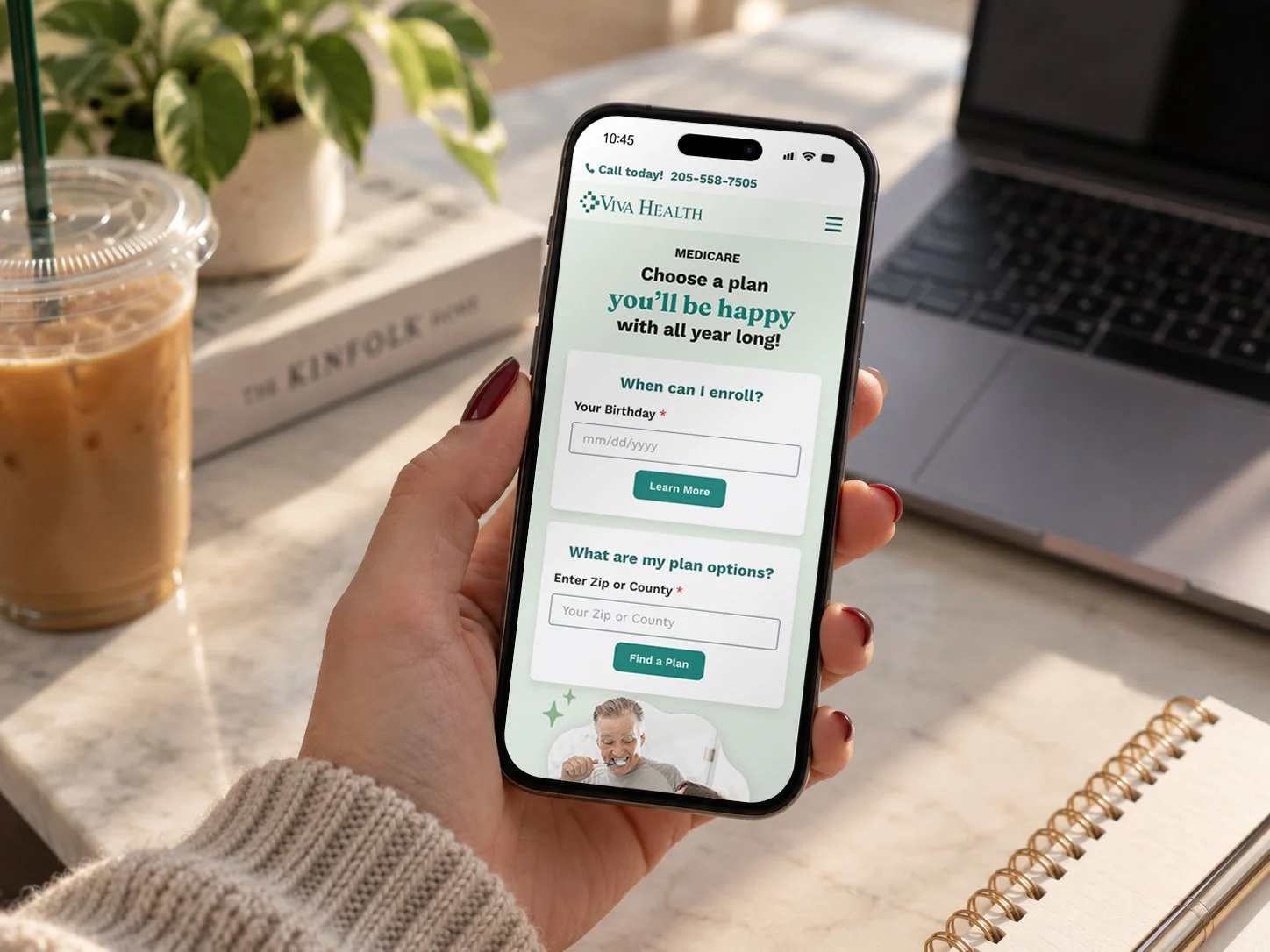
The redesign introduced a modern, approachable visual identity that balanced the professionalism of a healthcare organization with the warmth and accessibility that is at the core of their business values.
Beyond aesthetics, every design decision was rooted in usability, creating clearer content hierarchies, more intuitive interactions, and consistent experiences across the Viva Health, Viva Medicare, and provider sections.
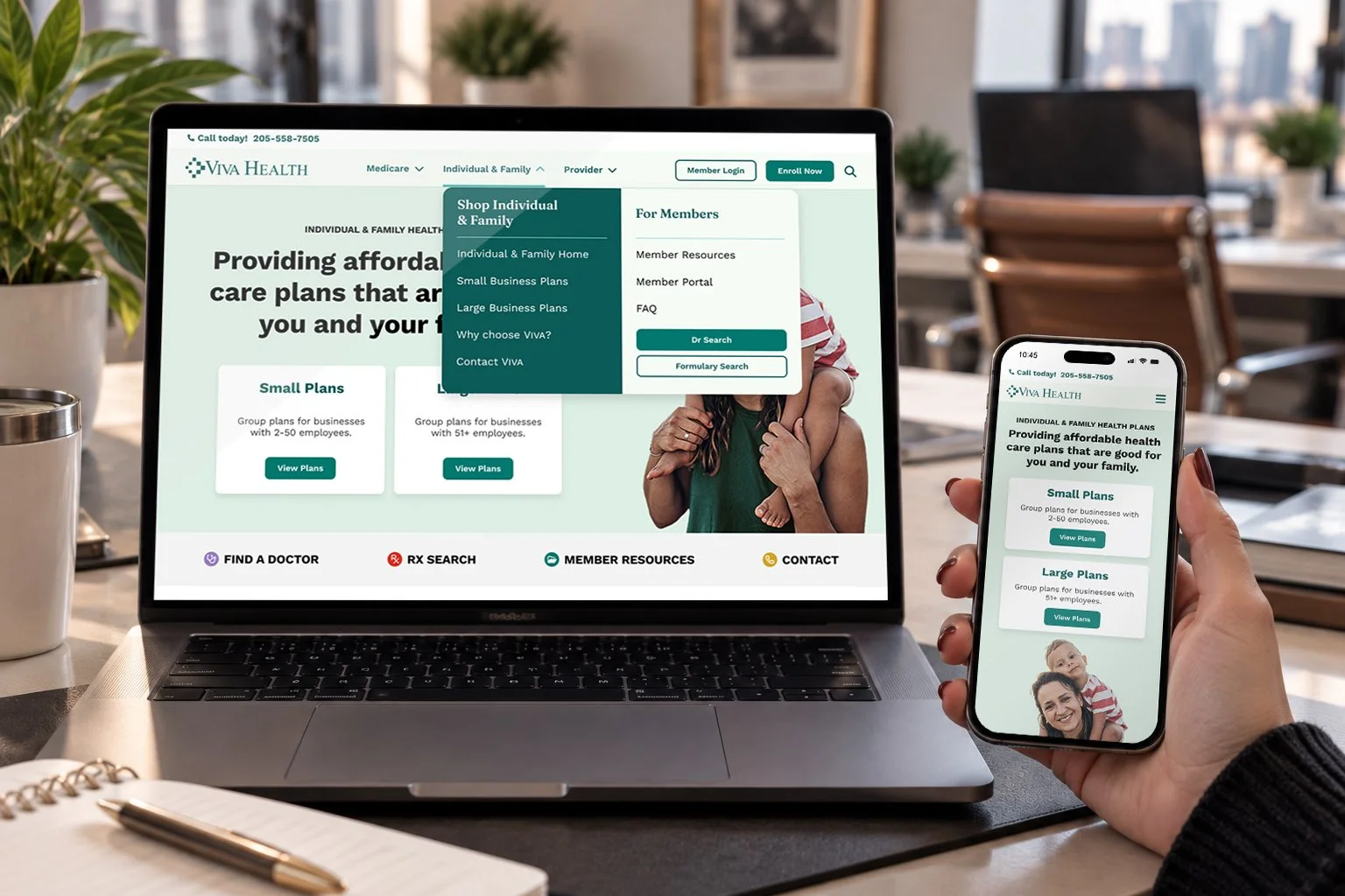
We worked hand-in-hand with the client to conduct a comprehensive content audit and collaborative card-sorting exercise, identifying opportunities to consolidate information, improve content organization, and create a more intuitive site architecture.
The result was a streamlined navigation experience, including a redesigned dropdown menu that helps visitors quickly identify the resources and services most relevant to them.
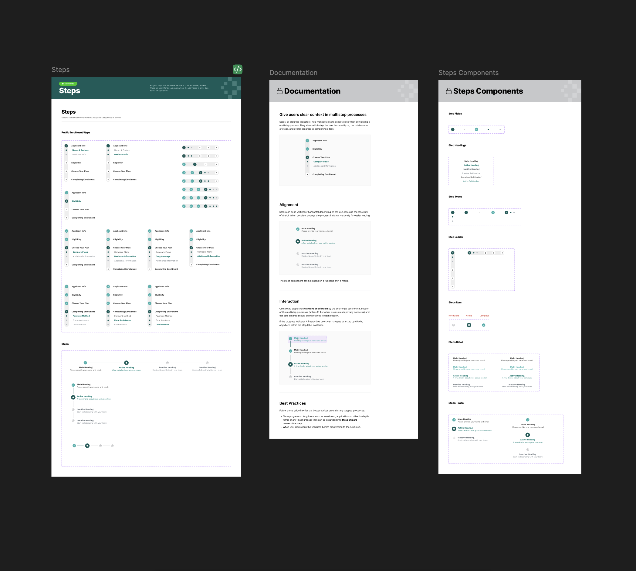
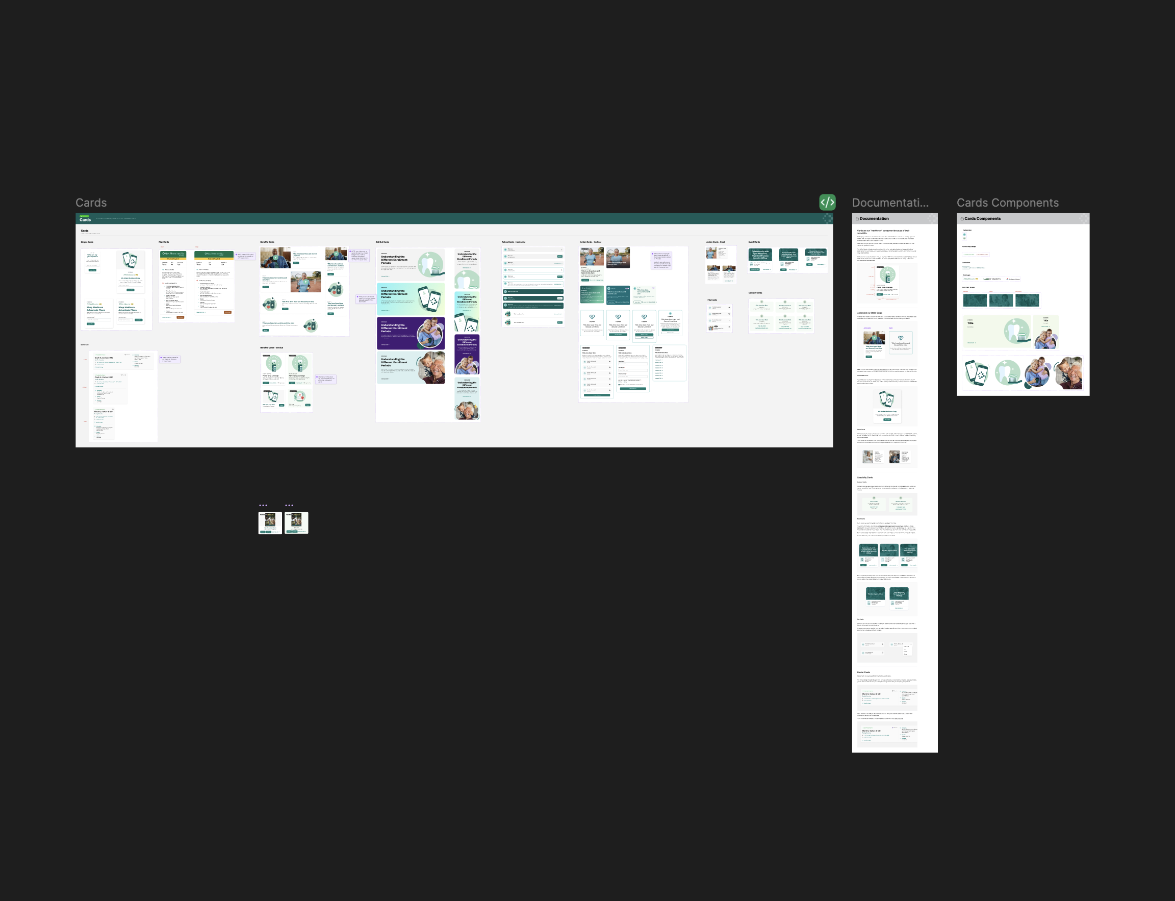
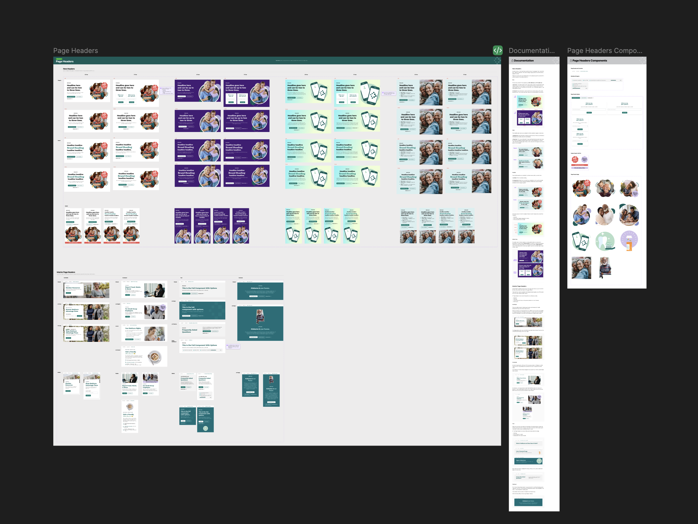
Building a Design System That Works Smarter
Rather than designing individual pages in isolation, I created a comprehensive design system from the ground up to establish a consistent, scalable foundation for the entire website.
Built around a modular, component-based approach, the system functions like a set of building blocks. Reusable elements can be combined and configured to support a wide variety of content and functionality without sacrificing visual consistency.
We partnered closely with development to build and validate these components before assembling the site's pages. This approach streamlined implementation, reduced repetitive design and development work, and created a flexible foundation for future updates and expansion.
Reimagining Provider Search
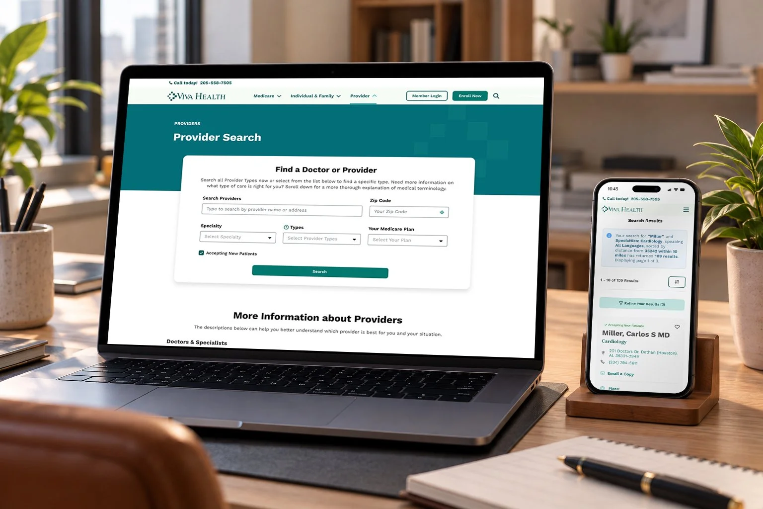
One of the most significant UX improvements centered on the provider search experience. Previously, users would encounter empty search results when entering too many criteria, creating unnecessary friction in one of the site's most important workflows.
We redesigned the experience around a simple principle: get users to results faster, then let them refine.
By reducing the information required upfront and introducing flexible filtering directly within the results experience, users can begin exploring available providers sooner and narrow their search based on specialty, plan, language, and other preferences.
The result is a more forgiving, intuitive search experience that prioritizes discovery over unnecessary form completion.
Designed for what comes next.
By combining user-centered research, thoughtful experience design, and a reusable component library, we delivered a more cohesive, accessible, and efficient experience while making future site updates easier to design and develop.
The client was extremely pleased with the final result and reported improved website performance and a more streamlined experience for its users.